Street FC
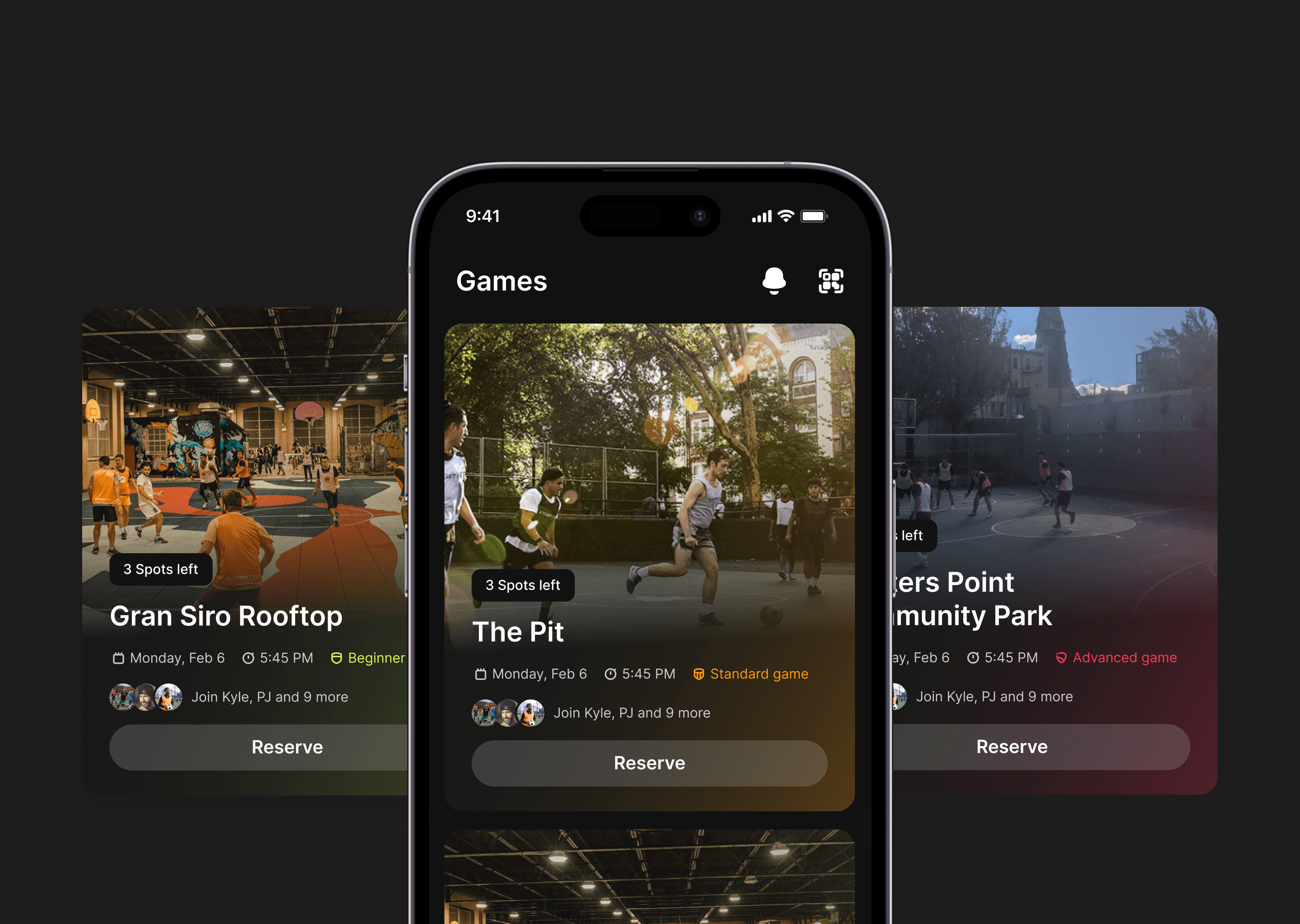
Street FC is building the biggest street football club on the planet. They host 100+ pick-up street soccer games monthly across NYC, Austin, and Philly. I led the redesign of their game cards.
The task
The task
The Street FC team was looking to start a redesign of their current mobile app. With limited resources on the engineering side, I had to prioritize which design components needed an urgent redesign and would bring the most value and impact to the user.
The Street FC team was looking to start a redesign of their current mobile app. With limited resources on the engineering side, I had to prioritize which design components needed an urgent redesign and would bring the most value and impact to the user.
My recommendation
My recommendation
As I started to take an in-depth look at the app experience myself, I noticed that the game cards were the heart of the app; every user would have to interact with them to rsvp or join the waitlist for any games from there. My recommendation to the team was to redesign the game cards as the first step to the more extensive overhaul, which is a complete app redesign.
As I started to take an in-depth look at the app experience myself, I noticed that the game cards were the heart of the app; every user would have to interact with them to rsvp or join the waitlist for any games from there. My recommendation to the team was to redesign the game cards as the first step to the more extensive overhaul, which is a complete app redesign.
Initial questions
Initial questions
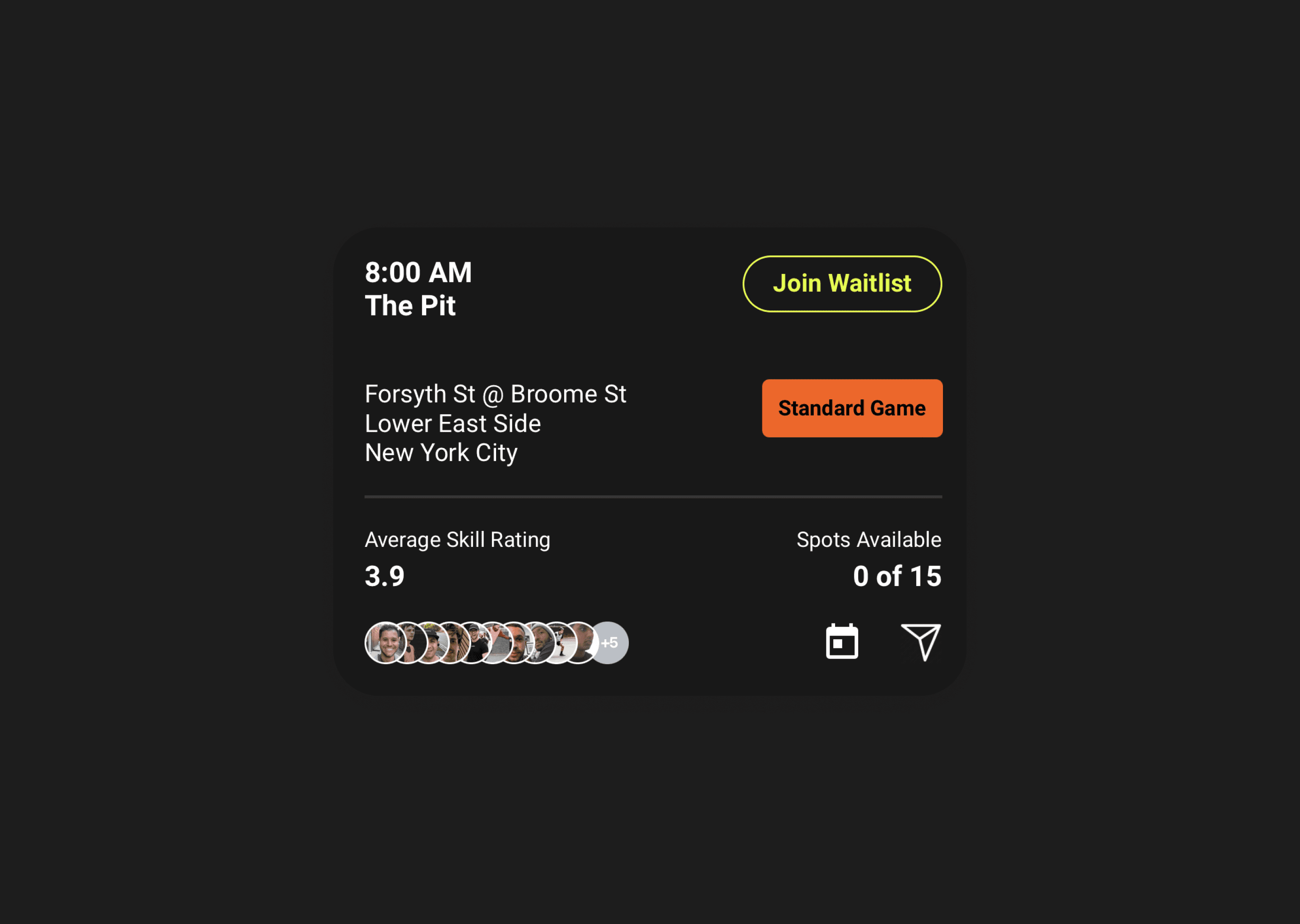
The game cards themselves were dense with information about a future game. My initial questions when interacting with the cards were:
Does all this info need to be on the card?
What information does a regular player find important when looking for a game?
What info is relevant to a first-time user compared to a power user?
There are multiple actions you can take within the card; are all of these equally important?
Research
Research
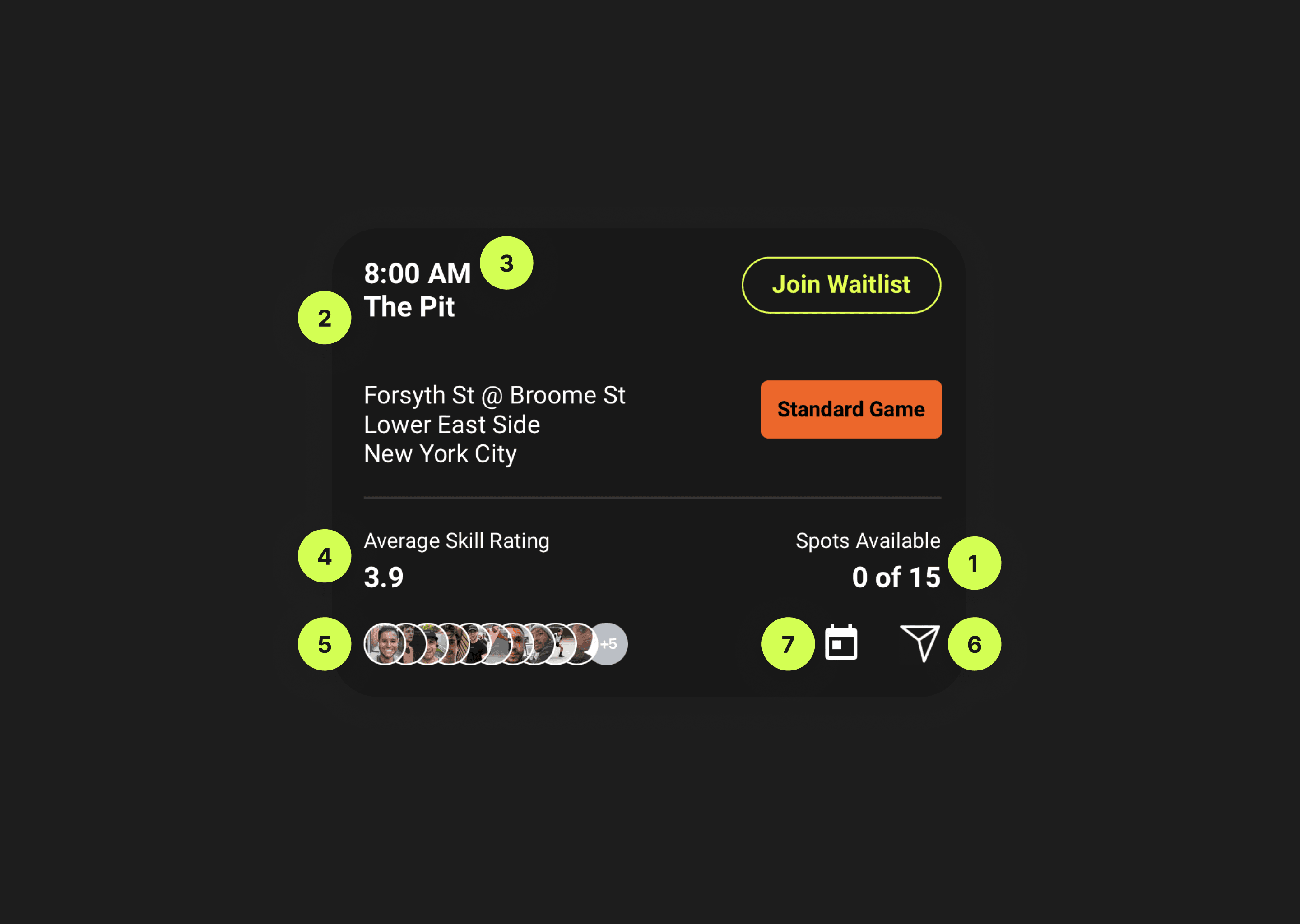
I needed answers to the questions above to redesign the game card successfully. I reached out to about 20 players who currently use the app regularly and have many games played. After interviewing these players, I noticed they only find particular information on the card relevant to deciding whether they want to attend a game. When asking them to rank the information on the current card in terms of relevancy, these were my findings:
1. Open spots left
2. Court/ location
3. Time and Date
4. Skill rating/Game difficulty
5. Familiar faces who signed up
6. Sharing game
7. Adding to calendar
Visual design
Visual design
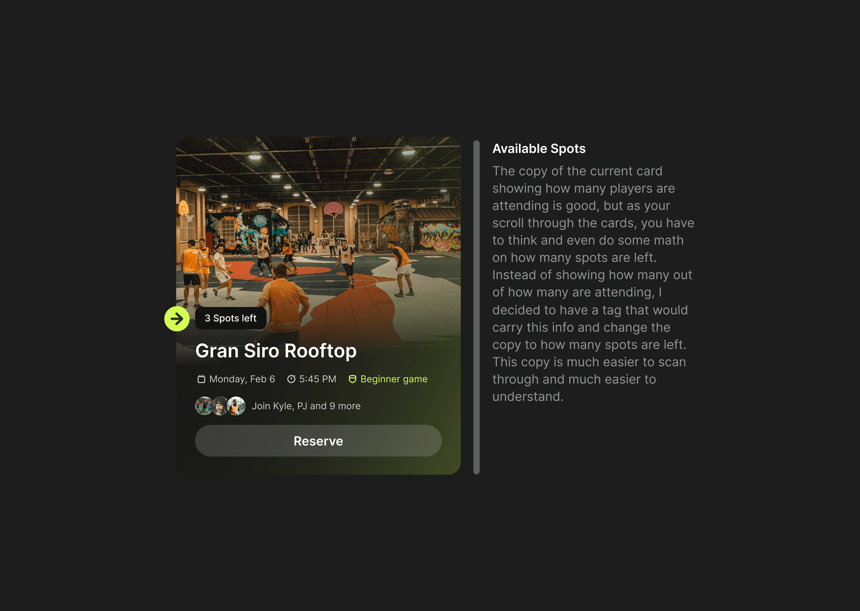
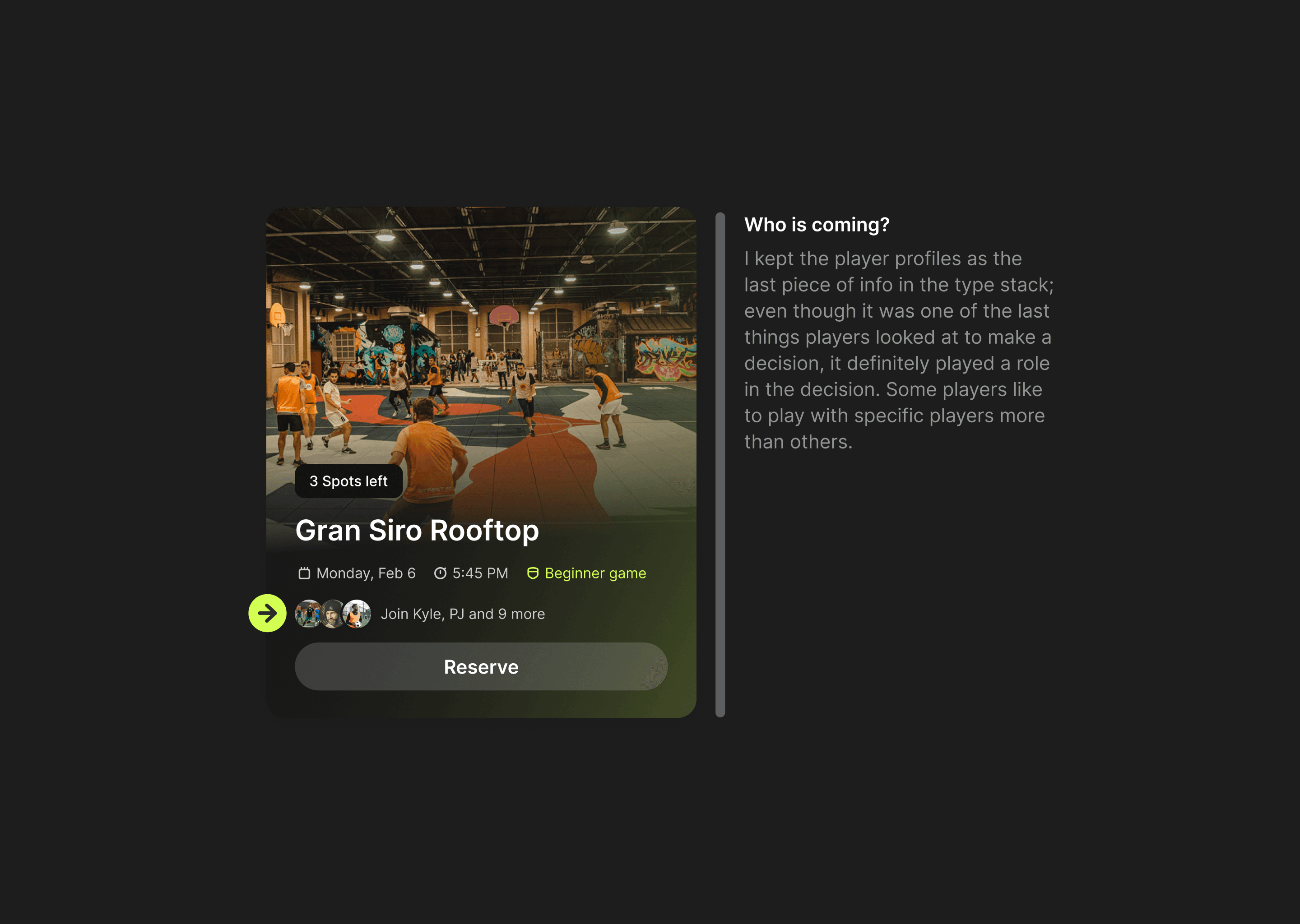
These findings helped me dictate the hierarchy of the content within the card and also add any visual flair that would make specific info stand out more than others.
These findings helped me dictate the hierarchy of the content within the card and also add any visual flair that would make specific info stand out more than others.




Eliminating actions
Eliminating actions
Sharing a game and adding to the calendar were ranked last in relevancy. I removed those from the card but kept them on the game details page.
During interviews with current players, they knew the locations of most of the courts on the app, so for them, it wasn't relevant, but as a first-time user, I would have to tap on the card and see all that extra information on the game details page. It was a tradeoff I made to make the card less cluttered.
Final touches
Final touches
Adding a subtle gradient to the card made it look modern. Making the gradient match the color of the difficulty will also help with scanning the game cards if you know the difficulty of the game you're looking for.
Finally, I added the court image; this will help first-time users see what court they will play at and what it looks like before deciding if they want to attend.
Next steps
Next steps
Create a high-fidelity prototype of our current mobile app experience with the new cards and test it out with first-time and existing players to get initial feedback and iterate.
Create a high-fidelity prototype of our current mobile app experience with the new cards and test it out with first-time and existing players to get initial feedback and iterate.
